Key Points
The massive daily swings continued yesterday—which wasn’t all that surprising after we just saw double-digit moves in plenty of ETFs and individual stocks. The SPX gave back 3.5%, but after a 9.5% spike, it almost felt… innocuous. What a time.
We’ve got some new charts to share today to help put this action in better perspective.
When to Use Short-Term Charts… Now
Why is now the right time to use short-term charts? I think we all know the answer—volatility is fierce, and the only way to detect bullish patterns in the very early stages of a potential comeback is to zoom in.
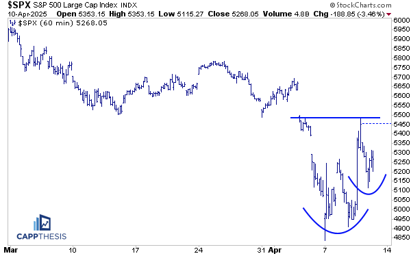
There are various time frames to choose from. Let’s start with the 60-minute version, which clearly shows he two recent tests of the 4800 area just this week—first on Monday, and then the explosive rally on Wednesday. Yesterday’s pullback then created a potential higher low. Put that all together, and it’s starting to look like a potential bullish cup-and-handle is forming.
Another reason the short-term view matters: the moves are so big right now even intraday charts are bigger than we sometimes see across multiple weeks of price action.
So yes, there’s still a lot of work to do, but this timeframe gives us the best shot at judging price structure in real-time, especially compared to a daily chart, where the bars are all crunched together and it’s harder to see the nuance.
So, what needs to happen for this pattern to play out? First, 5500 is key—that’s the clear top of this potential formation. Second, we need to hold yesterday’s low to keep this setup intact. And finally, we need some real follow-through from here.
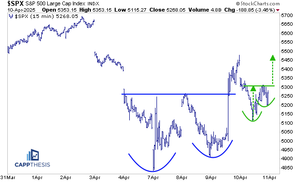
It can get there by leveraging this much smaller cup and handle pattern on the 15-minute chart. While the preceding double-bottom breakout was negated yesterday, the SPX did notch a higher low, which it will be trying to leverage today.
There’s plenty of work ahead—and yes, the patterns will continue to morph. But the only way to truly stay on top of these developments is by watching the very short-term charts, which we’ll continue to reference closely.
(We’ll also be providing intra-day updates in our Slack channel.)
Watching the SH (Short S&P 500 ETF) for Clues
This is a weekly chart of SH, the ProShares Short S&P 500 ETF (red) and the and the SPX (green), going all the way back to the ETF’s inception in 2006. As we know, inverse ETFs, ultimately drift lower over time, but during the most stressed moments for the market, they rally—and rally hard. That’s exactly what’s happening now. SH gained 26% from the 2/19/25 low (high for the SPX).
What’s notable here is that the SH is now sporting a weekly overbought condition for only the third time in its entire history. The other two instances? March 2020 and September 2008. Only a few other periods have even come close to the 70 RSI mark—all of which are highlighted on the chart.
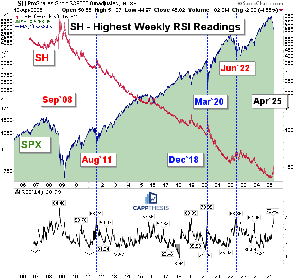
What makes this significant isn’t just how rare these signals are—it’s what tends to follow. Yes, major lows did occur relatively soon after some of these overbought readings—December 2018 and March 2020 stand out.
But that wasn’t always the case.
There were several other times when we had to wait months and endure significantly more volatility before a durable low came into place. As we’ll recall, September 2008 was when things really started to unravel, and the SPX didn’t bottom out until six months later.
August 2011 brought a major shock that dragged on through the fall.
And in June 2022, the market bounced—but it turned out to be just another bear market rally that ultimately failed.
So what does this tell us? We’re clearly in another bear market-like environment. A bottom will come, but there’s no guarantee it happens next week, in two weeks, or even in two months. But seeing SH’s weekly RSI retreat from overbought levels and continue to fall will give a sign that momentum is fading (and building for the SPX).
Support
We’ll continue to show this chart as long as the SPX holds near the important 4800-zone.
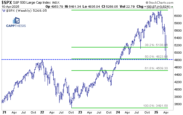
Supply
Ditto for the area that begins at the 5,500 zone, and given the short-term chart setups mentioned above, it’s even more significant to see the SPX reclaim this range.
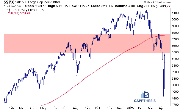
Moving Averages, Anchored VWAPs
Here’s where we stand with the moving averages and anchored VWAPs. Pictured on this chart are the 5-DMA (green), 20-DMA (light blue), 200-DMA (red); anchored VWAPs (4/7 white) and 2/19 yellow).
The SPX tested and held above the 5-DMA and the VWAP anchored to Monday’s low.
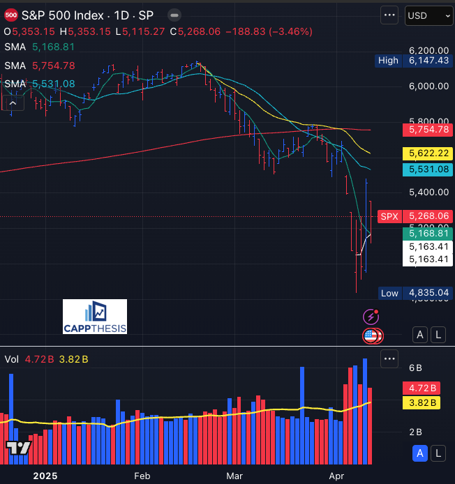
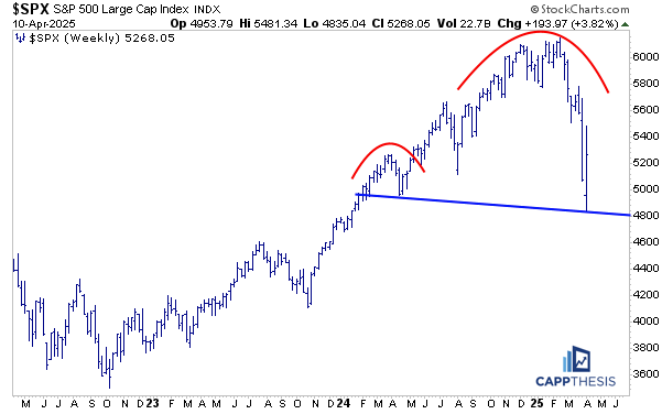
Potential Patterns
We covered the short-term patterns above, but we also need to keep the big ones on our radar screen, too – this one in particular – in case the rally efforts get faded and the SPX comes back to down and then through 4,800.
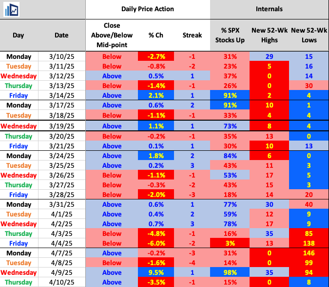
Daily Price Action
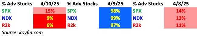
So far in April: eight trading days, six absolute 1% moves, with five being at least +/-3.5%…. a 97% negative and a 98% breadth session.
Sectors
The safe havens were back to outperforming on Thursday.
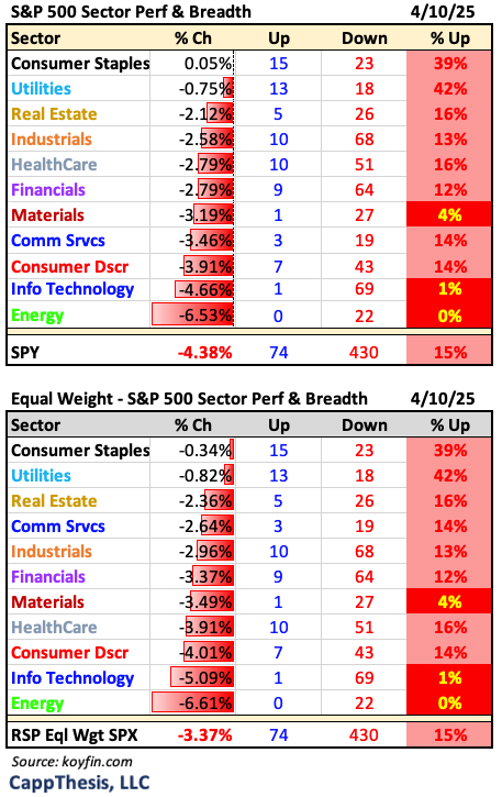
Breadth
Internals completely reversed, as well.
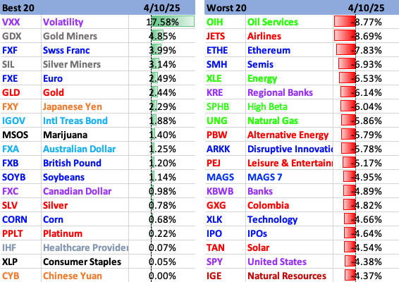
Best 20
Gold and Silver shined yesterday, while Energy and Growth got clocked.
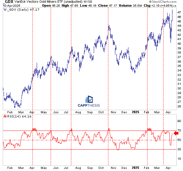
GDX Gold Miners
GDX jumped nearly 5% yesterday (and is trading higher again this morning), making a new high and continuing its snap-back rally. That’s clearly bullish, and the monthly breakout from the bullish pattern still looks compelling. But—as we’ve written before—chasing short-term breakouts in GDX hasn’t been the best strategy.
Each time it’s made a new short-term high, it’s reversed and filled the breakout zone shortly after. So until that changes, the better play is buying weakness on the next pullback—not chasing strength—and sticking with that approach until it stops working.
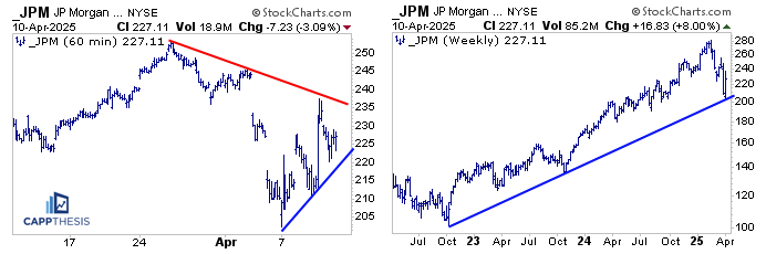
JPM
JPM is trading higher this morning, and that opens the door for a potential test of the downtrend line from the March high—which now stands as key short-term resistance.
On the weekly chart (shown here in log scale), the recent bounce came right off the uptrend line drawn from the October 2022 low—a level that continues to matter.
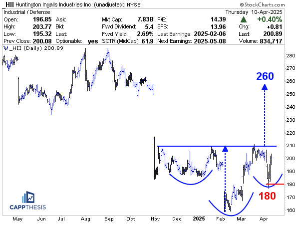
HII Huntington Ingalls
HII is trading higher this morning on some upgrades, which prompted us to take a closer look at the chart. It appears to be building a potential bullish inverse head & shoulders pattern.
What stands out here is the air pocket of light resistance above the neckline. If/when a breakout occurs, that lack of overhead supply could fuel momentum higher.
The measured move from the pattern targets the 260-zone—which just so happens to be near where the stock broke down back in October.
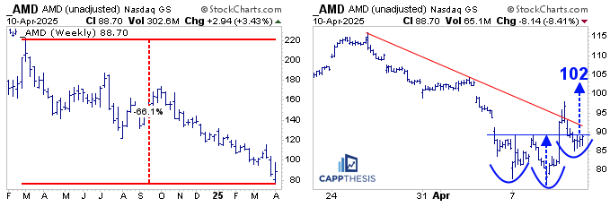
AMD
AMD has dropped 65% since topping in March 2024, and despite a few rally attempts, it’s consistently failed to challenge its long-term downtrend—especially since the steady decline began last October.
A closer look at the 60-minute chart shows some potential signs of life. The initial double bottom breakout was negated, but if the stock can reclaim the 90-zone, the breakout would be retriggered, opening the door to a measured move toward 102.
That kind of move wouldn’t put much of a dent in the long-term downtrend, but it would represent a respectable short-term advance—and potentially a starting point if AMD is going to begin clawing back from a brutal 13-month stretch.