Key Points
The SPX just missed logging another 1% loss on Monday and is now sitting directly on extremely key support. Given that backdrop, today’s note will be heavy on market content. We also have two new trade ideas — one long and one short — and seeing how they play out will be particularly telling.
Last 5 Trading Days
Daily Price Action – Losing Streaks
The SPX starts today with a three-day losing streak; the last longer run was five days from 8/15–8/21. The difference back then was that the largest single-day decline was just 58 bps — it was a true, harmless dip.
So far, this three-day decline has included losses of 1.7% and 0.9% (along with Friday’s 0.1% pullback), and that has kept buyers from getting too aggressive up to this point.
Sectors
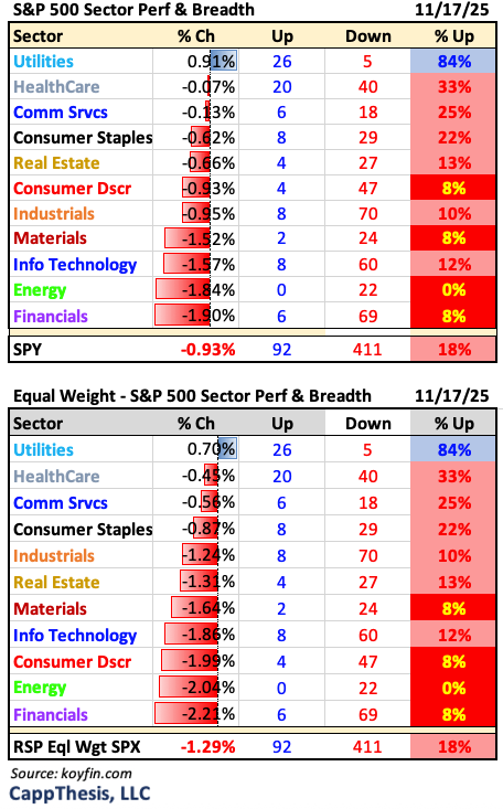
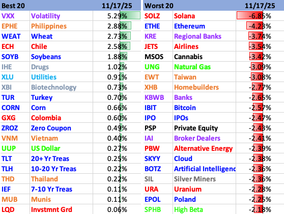
Utilities acted as a true safe haven yesterday, with XLU being the only sector ETF to log a gain and also show positive breadth. Four sectors had fewer than 10% advancing stocks, with Energy seeing all 22 of its components decline. That comes after Energy was the leading sector in the prior two sessions.
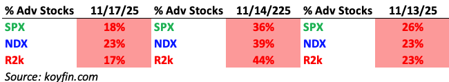
Index Breadth
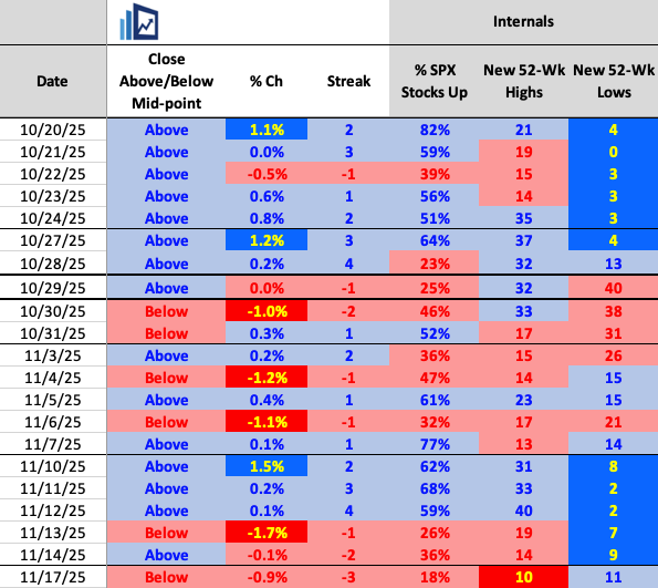
All three of the major indices posted negative internals for the third straight session yesterday.
Best & Worst 20 ETFs
Leadership was scattered on Monday, with only six ETFs we track logging gains of more than 1%. On the downside, crypto, regional banks, and airlines took the brunt of the damage, though we saw big declines across dozens of ETFs.
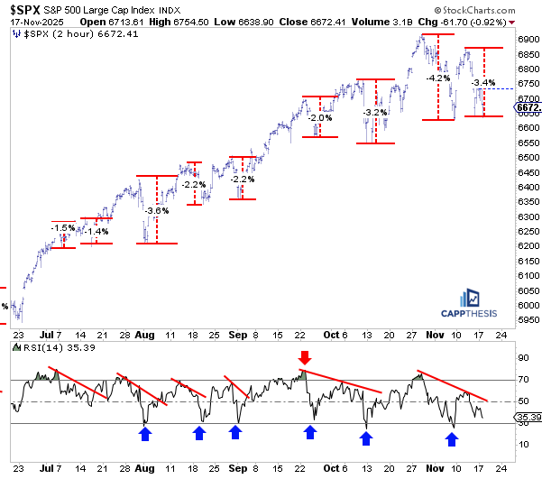
Teetering… Again
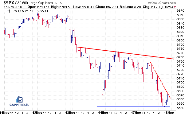
Turning to the pattern work first: as the title of the piece suggests, the S&P 500 is once again teetering near very important support in the 6630–6650 zone — a level we’ve been profiling over the last few days.
Even though the first bearish pattern was not fully leveraged two weeks ago, an even larger one has now taken shape, with the latest rally having been faded. As we can see here, another downside follow-through would complete this pattern and trigger a downside target near 6,360, which lines up with the early-September low.
That would place the S&P 500 roughly 8.2% below the last all-time high from 10/29 (6,920). Needless to say, that would be the largest drawdown of this move by far. For now, the pattern breakdown has not occurred, and we start the day with no live patterns officially in play.
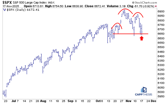
That means the bullish pattern still has a chance of playing out. We’ve adjusted the potential formation a few times along the way, but the main point remains: because the 6,630-50 zone has yet to be materially undercut, the setup is still live for now. As we know, things have been changing quickly, so this level remains critical.
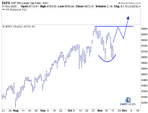
Short-term
Breaking these different pullbacks down on a more granular basis, we see that the latest drop from last week’s bounce high now totals about 3.4%. That decline, in isolation, is not alarming.
But as we discussed on the last rally attempt, the key to keeping parts of that strong trend intact would have been seeing the S&P 500 clearly push back to new highs and also seeing the 14-day period RSI on the two-hour chart return to overbought territory. Those two traits have been common — and repeating — over the last few months.
The premise, of course, was that if the index failed to make new highs and instead reversed and quickly returned to the lows, it would signal that momentum is starting to fade. And that is exactly what has happened so far.
Now it’s up to buyers to decide whether they want to step in and support the market again — the same dynamic that has fueled each bounce in recent months. If they don’t, it will show that patience is thinning, and that not being rewarded with immediate new highs — as they had been — could spark additional profit-taking
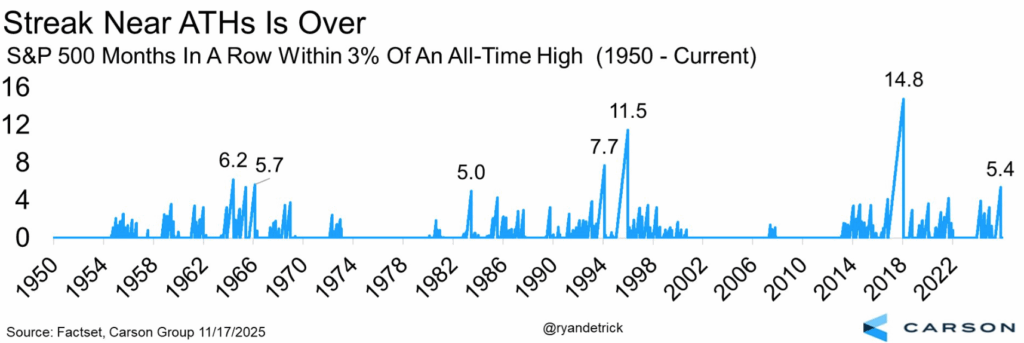
Streaks Close to All-Time Highs
We’ve been talking a lot over the last few months about how the comeback from the April lows has resembled the extremely consistent, low-volatility advance of 2017 in many ways. One more example: both in July and September, the S&P 500 logged zero absolute 1% moves— a pattern we also saw repeatedly in 2017, when this happened in six different months.
Additionally, S&P 500 had also remained within about 3% of its all-time high for nearly this entire run — but using closing data, that streak officially ended yesterday. This chart from Ryan Detrick / Carson Group illustrates the phenomenon: the S&P stayed within that 3% band for about 5.4 months, which ranks as one of the longest stretches since 1950.
But the chart also shows how different the magnitude was in 2017, when the index stayed in that range for almost 15 months — essentially from late 2016 through the start of 2018. And we know how that ended: with a volatility shock early in the year, followed by an even larger and more drawn-out volatility event in Q4, punctuated by the sharp December decline.
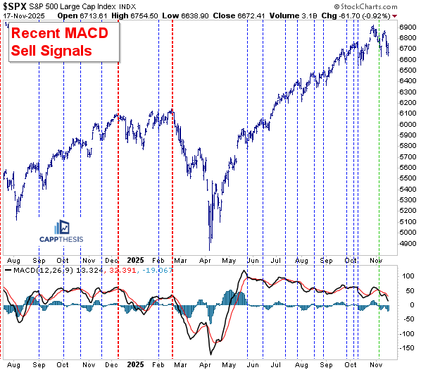
MACD
Even though the S&P 500 bounced right after the last MACD sell signal was triggered, the indicator itself has remained in sell mode, with the black (faster) line still beneath the red (slower) line. Because of that, there’s still a real chance of seeing the first sell signal from this indicator actually play out — something we haven’t seen since the February signal, which, as we know, nailed the top almost perfectly.
This will be an important one to monitor, since we consistently get useful information from this setup. When the market continues to rally despite a MACD sell signal, it tells us buyers are still eager to support dips. And vice versa: if the market struggles while the sell signal is active, it suggests dip-buying appetite is fading.
Sentiment
As you may have seen, the CNN Money Fear & Greed Index has been in Extreme Fear mode for most days since first slipping back into that zone on November 4. Yesterday it hit a new low for this pullback — 15 — its worst reading since mid-April, when the market was still very close to its low point.
Even more telling: on the way down earlier this year, the index first hit 15 in early March, after the S&P was already down more than 10% from its highs. In other words, the Fear & Greed Index didn’t “suddenly collapse” — it peaked back in early July and has been rolling over steadily ever since.
That makes the current extreme reading more meaningful, especially now that sentiment is much closer to “fear lows” than “greed highs.” From this perspective, it’s easy to assume everyone is bearish, or close to it, and that the sentiment pendulum has swung decisively to the other side.
But the important difference this time is that while many stocks have sold off, as the internal data shows, the largest and most influential names have mostly not. That creates a very different dynamic beneath the surface compared to typical broad-based corrections.
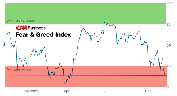
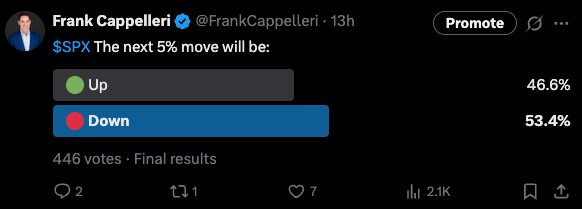
In fact, it stands in sharp contrast to a poll I ran on X last night, asking my followers what they believed the S&P’s next 5% move would be. Given the tone on X the last few days, I expected the results to be heavily skewed to the downside. But that wasn’t the case — while more people did vote for a 5% drop, the margin was much closer than I expected: 53% to 47%.
In other words, there are still plenty of investors who think the worst is over. And if that’s the case, it also implies they’re expecting good news from the biggest and most influential AI stock when it reports earnings tomorrow evening.
If the Mag 7 stocks looked like the Fear & Greed Index itself, then yes — it would suggest we were nearing an inflection point and a material bounce.
And a material bounce is still possible, but not because those leaders are oversold. It’s because they’ve been holding the market up, and if they rally, they can pull the entire index higher, just as they’ve done over the last few months.
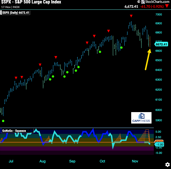
GoNoGo Trend – Daily
Repeating from the last few days: there’s a potential change afoot in the GoNoGo SPX chart — namely, a volatility “squeeze” has been in play.
After months of persistent strength, the S&P’s pullback has pushed the GoNoGo Oscillator down to zero, triggering a volatility squeeze. This places the market at a critical juncture.
👉 Yesterday’s downside follow-through did, in fact, flip the trend from bullish to neutral (amber). One day doesn’t make a new trend, but it can certainly start one — especially with the trend having been decisively up for so long…
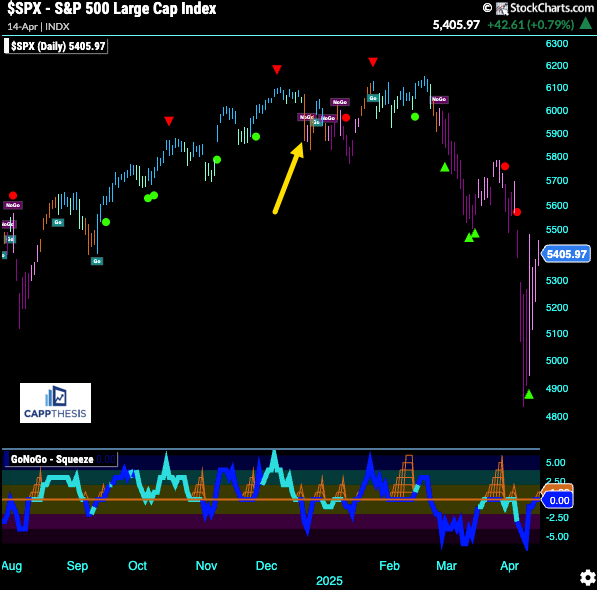
While there are countless past examples to choose from, here’s when the trend first shifted to neutral in December’24 after being decidedly bullish since early September.
As we’ll recall, this didn’t mark the top; in fact, the SPX regrouped and made a marginal new high a few weeks later. But this shift changed the market’s character, and that ultimately was leveraged to the downside soon after.
Again, that turn came in conjunction with bullish patterns failing and bearish patterns working.
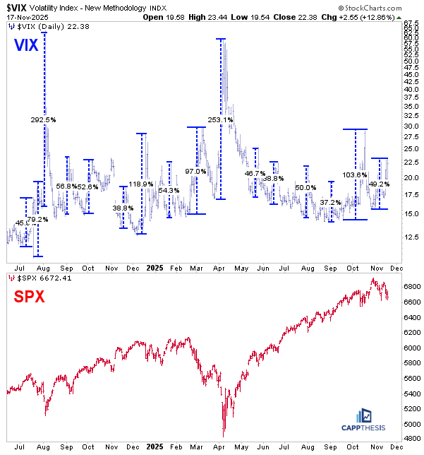
VIX Volatility
The VIX has continued to firm. From its late-October low to yesterday’s high, it’s up about 50% — a big number, but not from the VIX’s perspective. For context, from the September low to the October high, the VIX was up over 100%, but even that didn’t result in a big decline for the SPX… despite the significant carnage beneath the surface of the market.
Because the largest stocks are still holding up, the VIX hasn’t REALLY spiked yet. When those names “catch down” to the rest of the market — as they did in February–April of this year and in July–August of last year — the VIX can spike dramatically, with 250% to 300% peak-to-trough surges.
So in a sense, the VIX itself, also is teetering — but in the opposite direction. If the mega-caps weaken, volatility has plenty of room to accelerate.
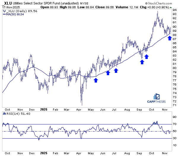
XLU Utilities
As noted above, XLU (Utilities) was a clear standout yesterday. As we know, this group has historically served as a classic safe haven, and it also carries the added narrative of being tied to AI infrastructure given its role in supplying the massive power load needed for data centers.
Yesterday, however, XLU’s strength was squarely in the safe-haven category, with the ETF bouncing off its 50-day moving average — a level that has been a reliable buy zone for the ETF going back to last May. The most recent rally attempt off this line, just last week, was short-lived, but XLU now has another chance to take advantage of that support.
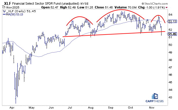
XLF Financials
We’ve been talking for a while about the ability of XLF (Financials) to hold its highs, despite being unable to extend much beyond last summer’s levels. The idea was that the longer it held, the better the chance it could eventually break out. But until that happened, it was essentially a trading range — with no real edge until a decisive move occurred.
Along the way, we profiled the growing number of individual financial stocks breaking out, which was a constructive sign. But yesterday, with financials under pressure, many of those breakouts saw profit-taking, and as a result XLF is now below a key support line.
Needless to say, with a clear air pocket underneath, buyers will need to step in quickly to prevent this from turning into something more problematic. While Financials aren’t exactly overlooked, we may forget that it’s actually the second-largest sector in the S&P 500 — meaning sustained weakness here can have a significant negative impact. On the flip side, if this breakdown turns into a bear trap, it would be a strong sign that the market can still hold things together.
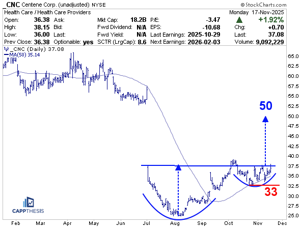
CNC Centene
As we know, it’s been more challenging to get the kind of follow-through we saw in prior months when the uptrend was going strong. Still, we’ll continue to highlight constructive formations as they appear, whether they are pressing to new all-time highs or forming large bases way below their highs.
One example is CNC, a healthcare provider that has been quietly building what looks like a multi-month cup-and-handle pattern. With a clear air pocket above, created by the huge earnings gap-down in July, the stock has the potential to take advantage of a breakout. If it can push through, an upside target near 50 is reasonable — still below the original gap area, but meaningful technically.
It’s also notable that CNC has held above its rising 50-day moving average, first after gapping higher in September and again following earnings just a few weeks ago. While many healthcare names look extended after their recent comeback, CNC may represent the next leg of strength within the sector.
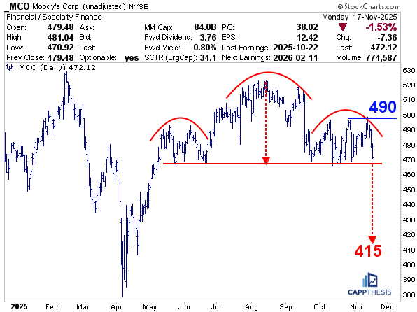
MCO Moody’s
Now, of course, if this is the beginning of a larger correction, we’ll see topping formations and other setups that create short opportunities — and MCO (Moody’s) is one of them. The potential bearish head-and-shoulders pattern is clear, and it has been under construction for a long time, going all the way back to May.
As we’ve said before, it can be difficult to see the largest bearish patterns actually play out — but with very little support underneath the neckline, we can see how additional downside action could trigger momentum, shake out stops, and pull MCO lower in rapid fashion. The measured move downside target would be around 415.
Again, with any of these potential tops, we’re always on alert for a quick reversal that turns the setup into a bear trap. But for now, we’re treating this as a valid short idea. It will also be very insightful to see how well a clear bearish topping formation is treated by the market. If it does play out, that would give us the conviction to start looking for more short setups.