Key Points:
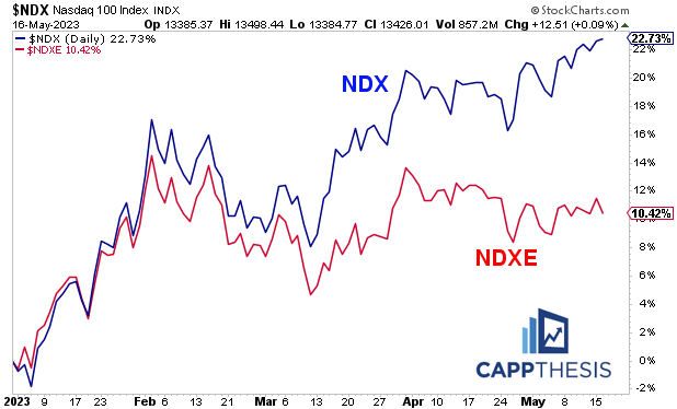
1- YTD, the NDX is +23% vs. the NDXE’s +10% gain, thanks in large part to the rebound from the March lows.
2- The weekly NDX/NDXE relative chart is overbought… However, going back to 2007, the initial overbought reading for the NDX/NDXE ratio only has nailed a major top ONCE– in late 2021.
Every other time, weekly overbought conditions led to additional relative performance – notwithstanding short-term pullbacks.
3– Thus, at any time, the NDX could stand to pull back on both an absolute and relative basis in the daily work. But if history is any guide, such a pullback could be temporary.
Topics Covered:
-SPX vs. RSP
-NDX vs. NDXE – various charts and stats
-NDX/NDXE relative ratio
-NDX
-QQQ Anchored VWAP
SPX:
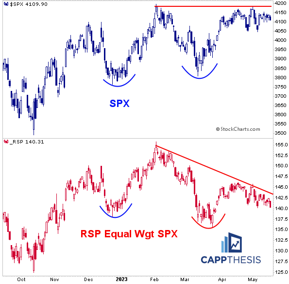
Yesterday was a bad day, with nearly 90% of the S&P 500 declining. The same theme prevailed, of course, with the biggest growth names helping shield a lot of the pain from the major indices.
Thus, the performance difference again was striking between the SPX (-0.6%) and the RSP Equal Weight S&P500 ETF (-1.4%). The charts continue to diverge.
NDX & NDXE
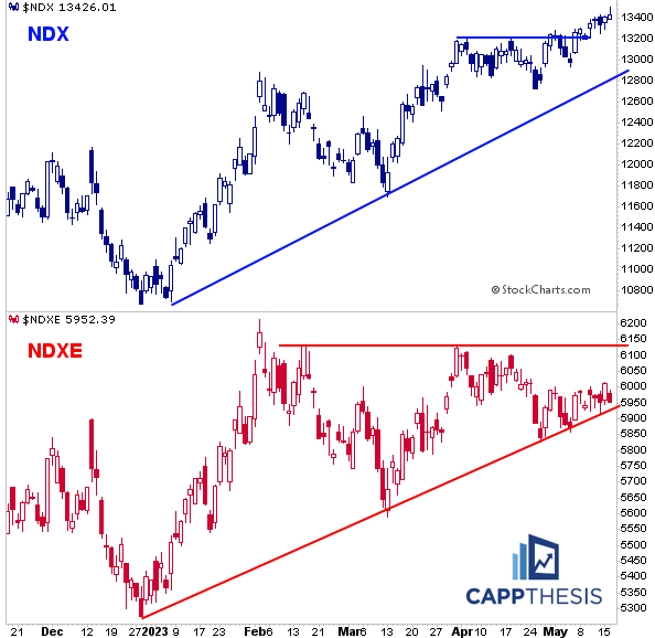
The same was true for the NDX (-0.1%) and the NDXE Equal Weight NDX 100 Index (-1.0%). The NDX now is up 5/6 days; the NDXE is down 4/5…
While they both remain in YTD uptrends, the NDX first reclaimed its early February highs by late March. The NDX has yet to do so.
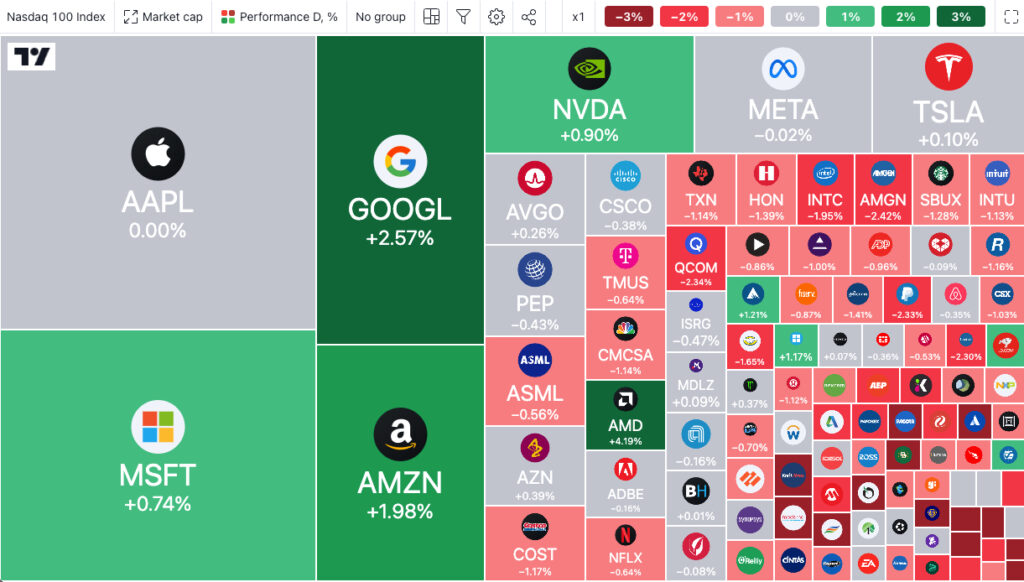
Here’s the NDX’s market map for yesterday via Trading View.
Even more remarkable is the YTD map. Note that the darkest green boxes here depict the components up at least 30% for 2023, which include ALL seven of the NDX’s biggest holdings.
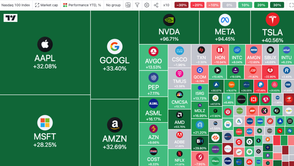
Indeed, there are other, smaller names up a lot, as well. But the YTD contribution of the biggest stocks have been gargantuan.
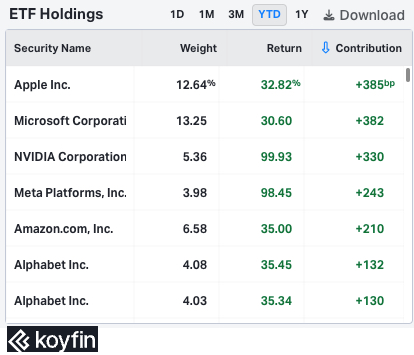
And that’s resulted in a distinct YTD performance discrepancy: the NDX is +23% vs. the NDXE’s +10% gain. As this chart shows, the two were moving in lockstep through January and remained aligned through early March…
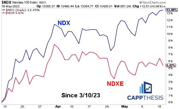
The rebound from the March lows is what really produced the separation.
NDX / NDXE
Not surprisingly, this has created a weekly overbought reading on the NDX/NDXE relative chart. At first glance, this appears quite ominous. However, the initial overbought reading for the NDX/NDXE ratio only has nailed a major top ONCE going back to 2007 – in late 2021.
As the chart clearly shows, every other time, weekly overbought conditions led to additional relative performance – notwithstanding short-term pullbacks.
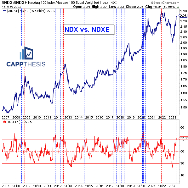
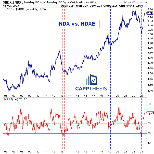
Even more telling is that the relative line has been coming back from a very rare weekly oversold reading. In fact, as 2023 began, the 14-wk RSI hit 23, which was the second lowest since 2006.
As is clear, prior oversold (or near oversold) readings eventually led to important relative lows three of the last four times. The only time that did NOT happen was in late 2009.
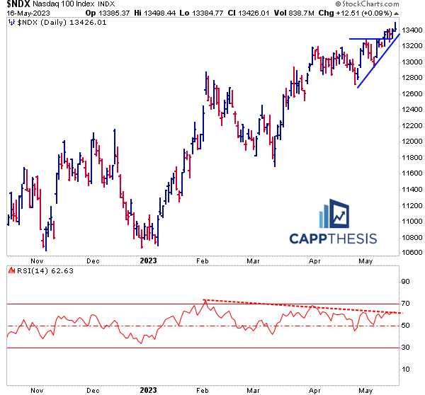
So… as discussed in Last Licks last evening, the NDX remains above its latest breakout point… but its 14-Day RSI has been flashing a clear negative divergence in recent days, which hasn’t mattered… yet.
Thus, at any time, it could stand to pull back on both an absolute and relative basis. But if history is any guide, such a pullback could be temporary.
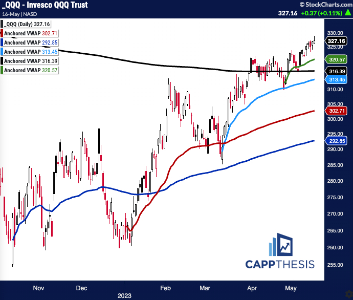
Anchored VWAP – QQQ
Needless to say, QQQ remains above all of the key Anchored VWAP lines.
Here is what we’re watching:
VWAP Lines:
Green: 4/24/23 – Recent low point
Black: 11/22/21 – the all-time high
Red: YTD AVWAP
Light Blue: 2023 low
Dark Blue: 2022 Low
