Key Points
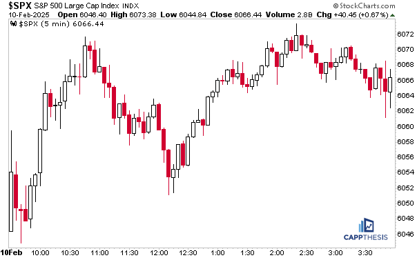
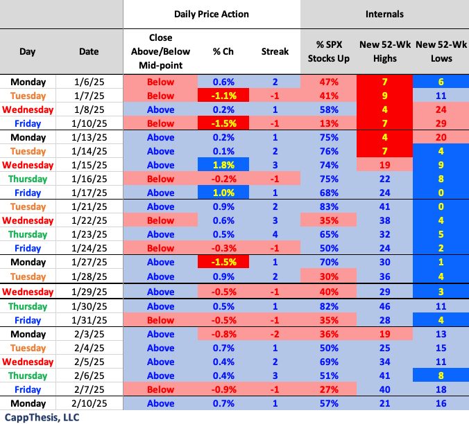
The S&P 500 scratched and clawed its way to a 0.7% gain on Monday, which was the index’s fourth gain in five trading sessions. The SPX now has closed above its intra-day mid-point and has had positive breadth 5/6 days, as well.
This is the veritable trifecta of strong daily price action that we look for every single trading session. More importantly, it’s the kind of data that we want and need to see repeated for the market to finally extend from the long trading range it’s now been in the last few months.
Today we’ll be showing the various ways to view said trading range and what it means for the market’s future path.
Trading Boxes
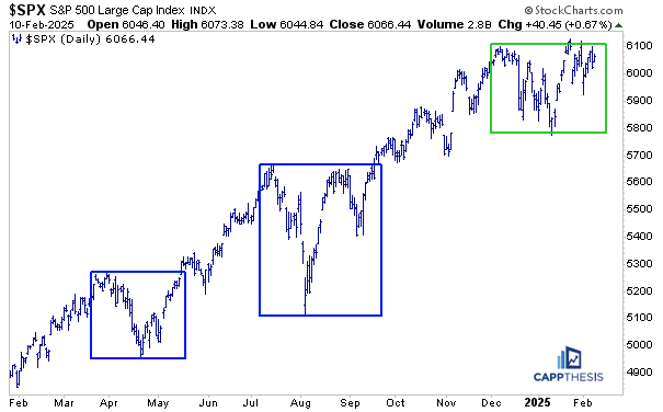
We discuss trading boxes a lot for a few reasons. They are easy to see, they are simple to understand, and they help show us the market’s dominant trend. More blue boxes = uptrend; More red boxes = downtrend. An equal amount of blue and red = trading range.
Again, we only color the boxes AFTER a breakout or breakdown (and follow through happens). Some boxes are easier to detect than others, i.e., some trading ranges are tighter. And when the breakouts (downs) occur, the follow through moves are clear.
That was the case from October’23 through, really, this December. Since then, though, the price movement has been more erratic, with the SPX exhibiting a false breakdown mid-January and then a false breakout in late-January.
Indeed, we still can draw boxes on the chart. The question is whether this version is the best way to view it. Yes, the SPX broke out from the late-December / early-January range with a strong second half, but that hardly encouraged the type of upside follow through we had been hoping for…
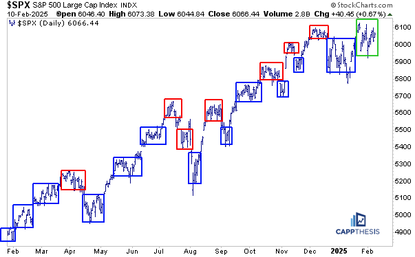
With the SPX having zigzagged since the election spike on 11/6/24, perhaps a better way to assess the price action the last three months is like this: one HUGE trading box. Doing this essentially replaces five smaller versions. This makes it look more like a rectangle; regardless, it noticeably stands out given how much bigger it is than the others.
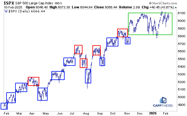
If we did the same thing for all of the price action since last February, there would be just three huge trading ranges or boxes. From this perspective, we’ve captured the last new high and new low of each period.
Clearly, the SPX has leveraged the last two big box breakouts and extended for multiple months upon pushing above the structure. So, while the current trading range seems quite long, it doesn’t appear too different than these other two from this point of view.
So, which of the last three versions is the “RIGHT” one? Technical analysis is both an art and a science. Eyeballing and manually drawing lines is clearly the art side of it. Using technology (AI or the traditional, boring kind) obviously is the science part:
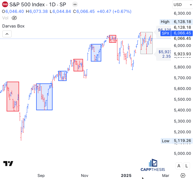
Trading View has thousands of indicators and codes to choose from – some of which attempt to capture trading boxes. Here’s what the system spit out using one of their trading box indicators for the SPX. This collection looks a lot like the smaller boxes we’ve been showing all along…
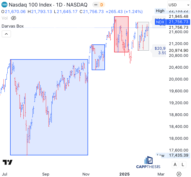
However, for the NDX, the code decided to classify the July – November massive range as one big box. (For the SPX above, the same period is broken into four different boxes.)
The bottom line is that there is not a singular correct way to draw trading boxes – as is clear, the manual and automated approaches give various outcomes. The important takeaway is to use a process that makes the most sense to you and helps properly manage risk, which is what we try to help with every morning.
Live Patterns

The SPX extended a bit further yesterday from the bullish falling wedge pattern (target 6,290).
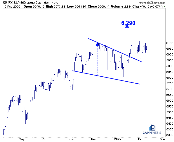
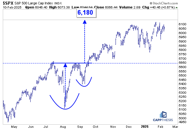
The cup and handle pattern also remains intact, with a target of 6,180…
Potential Patterns
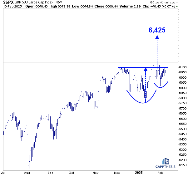
The index got a bit closer to triggering the next potential cup and handle pattern, as well.
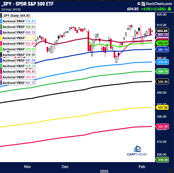
SPY Anchored VWAP
SPY starts Tuesday above all key VWAP lines.
SPY
Purple: 1/27/25 – Deepseek
Red: 11/6/24 – Election spike
Pink: 1/10/25 – Dec jobs report
Lgt Green: 12/18/24–Hawkish cut
Blue: 9/18/24 – 50 bps cut
Light Blue: 8/5/24 – Pivot low
Red: 10/31/24 – Gap lower
Green: 5/31/24 – Pivot low
Yellow: 1/2/24 – YTD VWAP
Pink: 10/27/23 – Oct’23 low
Purple: 1/4/22 – 2022 high
Green: 10/13/22 – 2022 low
Daily Price Action
As mentioned above, the intra-day price action has been constructive so far in February. The next step would be seeing the number of new highs expand.
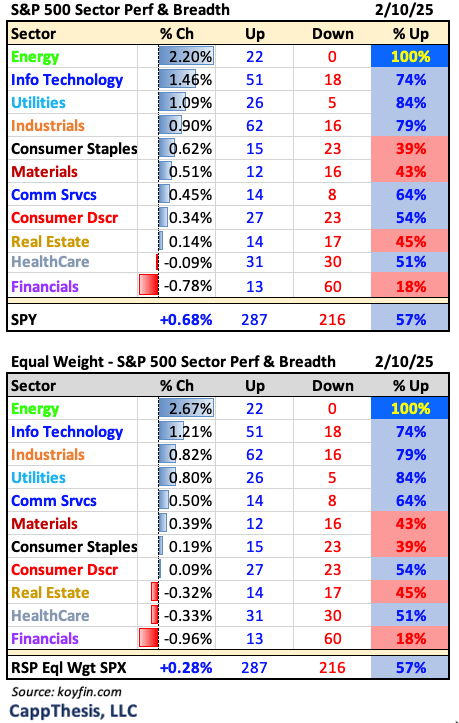
Sector Performance
Energy has been the sector leader now four times in the last six trading sessions, and yesterday every Energy stock within the S&P 500 advanced. More on XLE below.
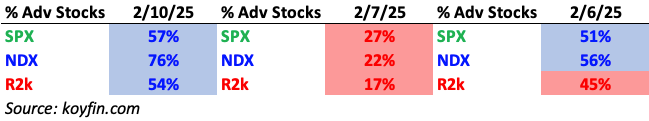
Breadth
The NDX had the obvious edge in breadth to start the week.
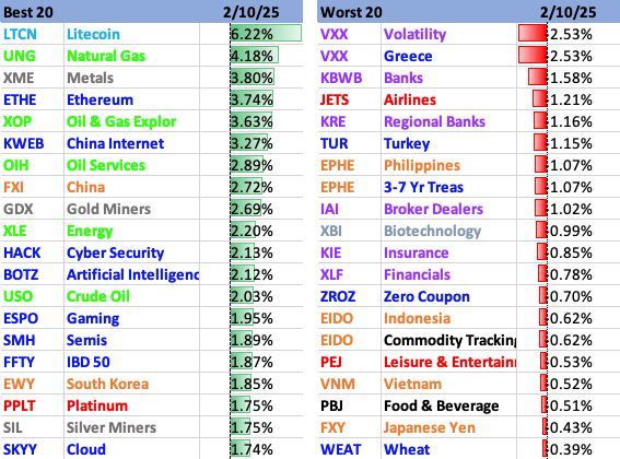
Best and Worst 20 ETFs
Energy, Metals and Tech led yesterday, as Financials lagged.
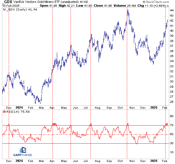
GDX Gold Miners
GDX was up another 2.6% on Monday and now is +26% from its 12/30/24 low. With its 14-day RSI now above 75, it’s the sixth overbought reading since Dec’23. Not surprisingly, GDX paused soon thereafter each prior time. More importantly, three of those overbought readings took place in the middle of the ETF’s strong 2024 run.
So, while being extended now may not be the best short-term risk-reward scenario, it could be the start of another, longer upswing. As profiled in the monthly Roadmap piece last week, GDX continues to build a large bottoming formation.
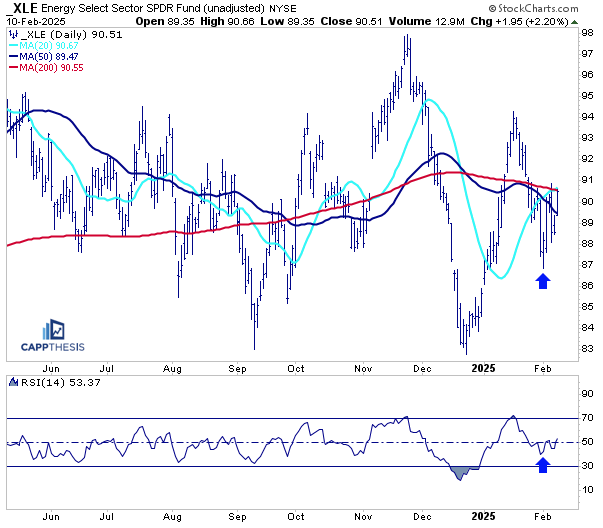
XLE Energy
XLE (along with XOP and OIH) was among the ETF leaders on Monday and now is trying to turn last week’s price action into a key higher low. The ETF continues to flirt with its 50-DMA, which it has shot above and sliced back below various times over the last year.
So, while this is another good start, for anything to change for the long-term, we’ll need to see demand continue at higher prices. Up until now, strength has been sold any time XLE has rallied back to the mid-90s.
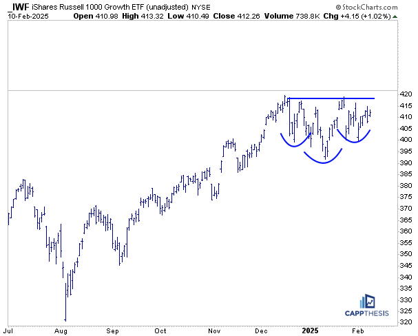
IWF Large Cap Growth
With Technology outperforming yesterday, IWF gained 1%. As is clear, the ETF is getting close to completing this two-month inverse H&S pattern.